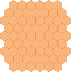
This is what I started off with from the beginning, I thought the grid looked quite good this way. In the pointy orientation the 'row hexagons' are touching along a straight horizontal line, which makes it simpler to work with.

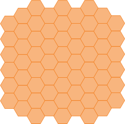
This is the more conventional use of a hexagonal grid however, with the flat side up. In this orientation, the hexagons along the X-axis are not touching in a straight line, instead every second hexagon 'dips' down, so the result is a jagged X axis. This makes it more difficult to work with, although it's possible to simply treat this as a rotation of 90 degrees of the pointy version.

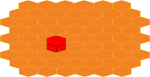
Now a grid on its own is not much to look at, so I decided to stick 'a building' on top of it, which is nothing but an extruded hexagon which looks like a hexagonal prism. I also squashed the hexagons along the Y-axis, this has the effect of giving it the illusion of perspective.
Looks quite good I thought.
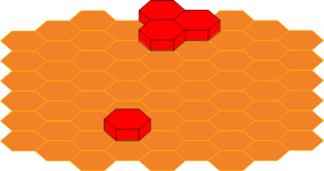
Then I did the same for the other orientation and was blown away.
The flat side up orientation looks much more realistic once you start putting things on top of it.
I decided to make an unsquashed version too:
Even without the squashing/perspective fix, the flat side up wins in terms of being most pleasing to look at. I haven't tried to do a shear effect on it, but with that I would imagine the perspective would be even more realistic.
-i


