Yosemite is downloadable from the App store.
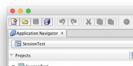
First thing that jumps out at you is the new flat interface, it almost looks like a cartoon, but this works really well I think. Some of the buttons are a little confusing however since the toolbar area is now merged with the window title, or rather there is no more title bar!
Even the older apps (JDev 11g in this case) look nicer with the flat look. (though Java needs to catch up!)
The dock is now flat as well. The iTunes icon is red, not sure I like this one, seems like a warning sign being lit up in the dock, maybe that's something to get used to though.
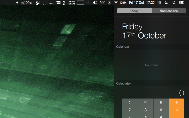
You can also change the dock and the menu bar to the new dark theme from System Preferences, General...and it looks awesome.
The notification centre shares the same space as the 'Today' pane, very useful, you can even add a calculator there.
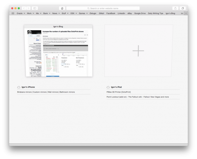
Safari can now use Continuity and open tabs from your other iDevices, that's pretty cool.
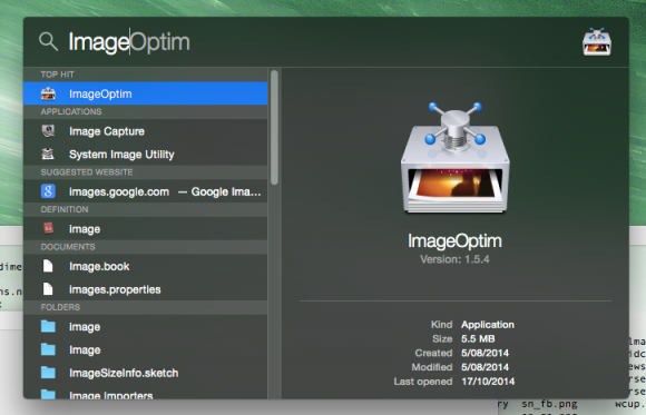
Spotlight pops up in the middle of the desktop and has been completely revamped now.
Overall I'm pretty happy with the new updates. I was surprised that I did not have to reinstall Java (for a change!).
The only grip I have is that some of the animations feel very jerky. This is evident in the Save dialog. Mavericks didn't have this issue, so I hope this is a temporary thing that will get fixed soon.
-i


