20-Oct-2014
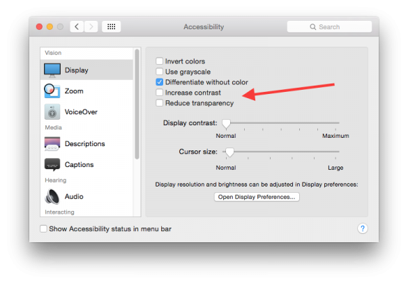
If you don't like the new transparency features in the OS X Yosemite interface, there is an easy way to turn them down, and while at it you can make the all of the UI features stand out quite a bit more and not blend together as much as they do by default.
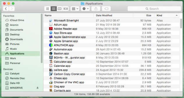
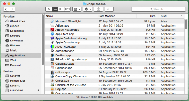
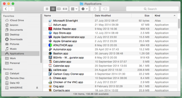
This is what the differences look like when looking at Finder.app.
Default Yosemite look
The background image bleeds through parts of the interface.
Increased Contrast Yosemite look
No background bleeding through and much more solid outlines on the controls.
Reduced Transparency Yosemite look
No background bleeding through but same blended controls.
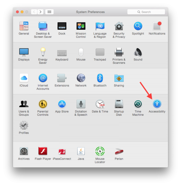
To turn these features on, go to System Preferences and then Accessibility.
-i
A quick disclaimer...
Although I put in a great effort into researching all the topics I cover, mistakes can happen.
Use of any information from my blog posts should be at own risk and I do not hold any liability towards any information misuse or damages caused by following any of my posts.
All content and opinions expressed on this Blog are my own and do not represent the opinions of my employer (Oracle).
Use of any information contained in this blog post/article is subject to
this disclaimer.
Igor Kromin
