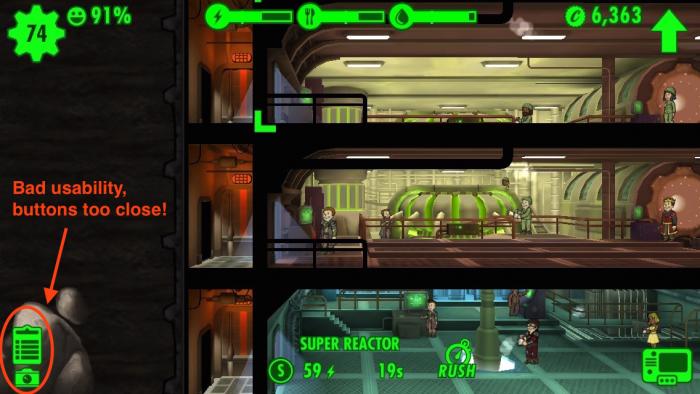
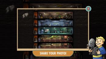
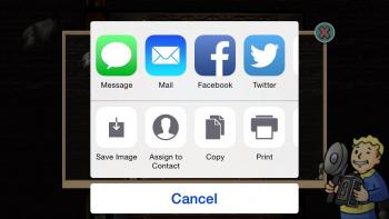
Here's what the offending button does, if you don't know why this button is a cause for grief, read on below, but first let me tell you what it does. Tapping the camera button at the bottom-left of the screen lets you take a screenshot of your shelter which you can then share on social media, through a message, just save the image, etc. Not sure why the usual approach of holding down Home and clicking the Power button to take a screenshot was deemed not enough, but there you are.
So why is this such a pain you ask. Look in the screenshot below, the camera button is immediately below the room list button (something that's actually useful). There is very little spacing between these two buttons and it is very easy to click one when you are actually wanting to click the other. Usability testing? I don't think Bethesda heard of that!

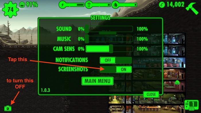
To disable the screenshot button, open the settings window and tap the Screenshots feature to off. It's as easy as that.
-i


