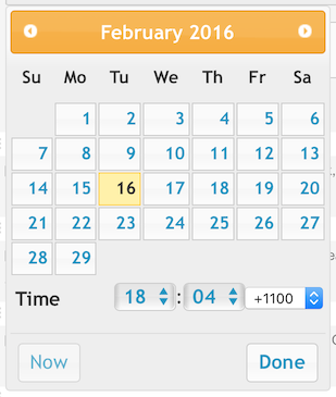
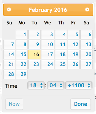
It appears that the input select is not styled. Below is what it looks like (left) and what it should look like (right)...


When you look at the HTML behind this and compare the minutes select to the time zone select, there are obvious differences:
HTML
Minutes select -
<select class="ui-timepicker-select ui-state-default ui-corner-all"...>
Time zone select -
<select>
At first it looks like there is no easy fix, but fortunately the time zone select is inside a dd element that does have class definitions - <dd class="ui_tpicker_timezone">. Great! This means we can do something about styling!
I'm using the default theme for the rest of the jQuery UI widgets so all I did was combine the CSS styles that the minutes select uses and added the following CSS rule to my custom stylesheet...
CSS
dd.ui_tpicker_timezone select {
border-top-left-radius: 4px;
border: 1px solid #cccccc;
font-weight: bold;
color: #1c94c4;
margin-left: 2px;
}
When the above is added, the time zone select is rendered correctly.
I also tried dynamically adding the missing style classes to the select using jQuery, this works at first, but as soon as you pick a value it reverts to the old unstyled look, so I abandoned that idea.
Enjoy!
-i
