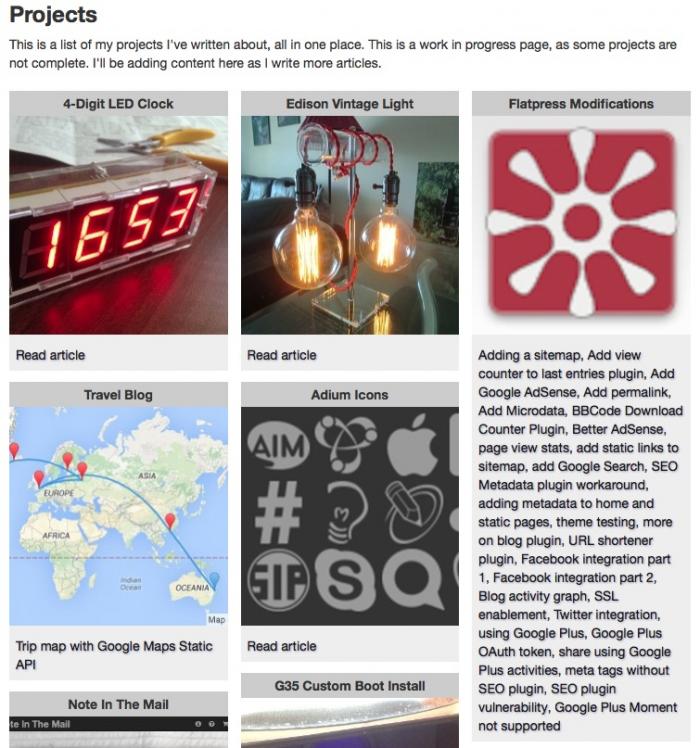
This was the end result...
The CSS/HTML I had to use is a bit messy due to the Blog software I'm using so I put together a simple stand-alone example here: https://github.com/ikromin/misc/blob/master/html/pinterest_columns.html.
Lets look at some HTML.
HTML
<div class="columns">
<div class="pin">
<div class="pin_content">First pin content</div>
</div>
<div class="pin">
<div class="pin_content">Second pin content</div>
</div>
</div>
That's pretty straight forward, just a wrapper DIV with class 'columns', this ensures that the content inside is split into columns. Then I have a DIV for each of the 'pins'. The nested DIV with class 'pin_content' is where the actual text/images/etc goes.
The complimentary CSS for the above is:
CSS
.columns {
-webkit-column-count: 3;
-moz-column-count: 3;
column-count: 3;
-webkit-column-fill: auto;
-moz-column-fill: auto;
column-fill: auto;
}
.pin {
-webkit-column-break-inside: avoid;
-moz-column-break-inside: avoid;
column-break-inside: avoid;
padding-bottom: 1em;
}
.pin_content {
background-color: #ccc;
padding: 0.5em;
}
Also fairly straight forward. The 'columns' class is set up to split its content into 3 columns and fill them automatically without trying to balance their heights. I noticed this doesn't work very well with just 4 pins, but other combinations of pins looked ok.
The 'pin' class makes sure the content inside it is not split across columns and adds padding at the bottom, this is what creates the vertical gap between pins. For some reason I noticed that adding a bottom-margin to this class made things look odd, hence the padding and a nested DIV. The 'pin_content' class can be styled any way desired, I just added a background colour and some padding.
From my example on Github, using column layout produces this...
Meanwhile if I remove the 'column' class, I get this...
Pretty cool! Don't forget to check out the page that inspired this post - My current and past projects.
-i


