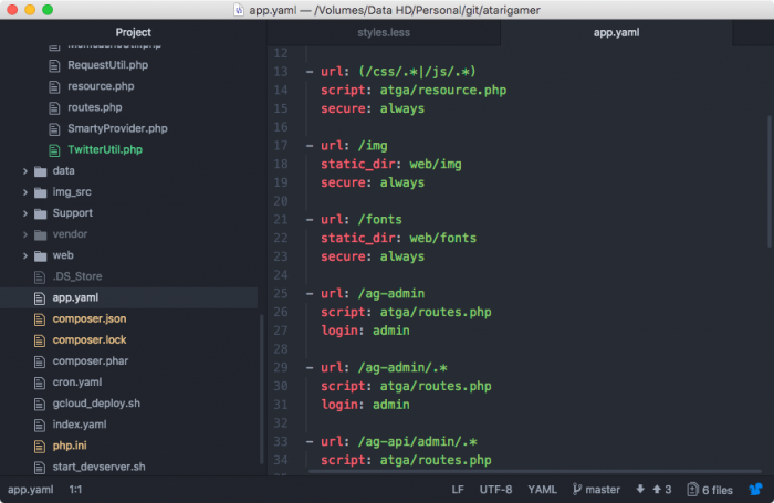
This is what the scrollbars were looking like before my change...
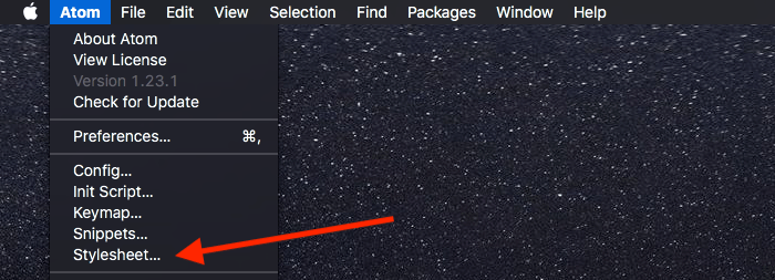
Changing them was very easy. The required changes were in the Stylesheet (style.less) that Atom uses to render the interface...

I added this to the bottom of the stylesheet...
style.less
.scrollbars-visible-always {
::-webkit-scrollbar {
width: 12px;
height: 12px;
&-track {
border: 0px;
border-radius: 0px;
background-color: #444 !important;
}
&-thumb {
background-color: rgba(255,200,200,0.35) !important;
border: 0px;
border-radius: 9px;
}
}
}
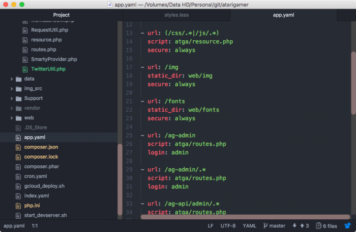
The above changes made the overall thickness of the scroll bars wider, 12px in my case. The height controls the thickness of the horizontal scroll bars and width controls the thickness of the vertical ones. I also made the track stand out more from the rest of the editor. The 'thumb' or the bit of the scrollbar that does the scrolling was also updated to stand out more using a reddish tinge and having a pill shape (via border-radius).
Of course this is all highly customisable and you can pick and choose your own colours, widths and other styles.
This is what it looked like for me after the change...
A huge improvement in terms of usability!
In my case saving the stylesheet automatically applied the changes, but from what I read sometimes it is necessary to switch tabs before changes take effect.
If you have ideas or improvements on the above changes I've made, please share them in the comments.
-i


